case study:
ClearVote
Political Candidate Research App

The Problem
As a permanent resident (non-citizen), I have always approached political candidate research from a curious spectator perspective. I am highly engaged in political news and enjoy learning more about new or elected politicians I hear about on the news, and occasionally donate to campaigns I believe in. When I started this project, I soon discovered that in-depth research for the purpose of making informed decisions in the voting booth is incredibly difficult and not always enjoyable! Voters have a hard time finding nuanced information about candidates running for office without doing a lot of time-consuming research, and referencing many different sources of information. This is especially hard in Primaries where many candidates have similar issue-based platforms.
My Role
This was a capstone project as part of a UX course. I was the sole designer with one main internal stakeholder. I was responsible for UX research all the way through to design and usability testing. The project was presented to both internal and external stakeholders at key stages, with a final presentation after completion.
Timeline: 6 months
The Solution
I wanted to create an app that would offer voters (or soon-to-be-voters like myself) a simple way to compile all the information they want to know about a candidate, with links to sources so that they have everything in one place rather than having to reference multiple resources.


The Approach
Secondary Research
To gain a better understanding of the problem space, I read articles on how to effectively research candidates, the different kinds of information voters typically look for, and where to find information. I took political topology quizzes to learn more about myself as a voter and to get a sense of how political questions can be phrased to extract meaningful answers. I felt this would be valuable for interviews I would be conducting later with actual voters. I also did a competitive analysis of several research resources that were recommended in the articles I read and I found additional websites and apps through google searches.
One key finding from the competitive analysis is that there are many websites and resources dedicated to different aspects of candidate research and it is easy to get lost or sidetracked. Most of these websites are poorly designed and visually exhausting to read through, particularly government websites which are rich in content but hard to navigate effectively.

Primary Research
Interviewed 6 voters to better understand their needs, research processes and donation habits. The interviewees ranged from ages 35-50. They were from different ethnic backgrounds. Some were US-born Americans, others were naturalized immigrants. But they were mostly of similar socio-economic status. All of them were skilled professionals working in tech, design, or entertainment.
Affinity Mapping Exercise
Armed with in-depth notes from my interviews, I began to sort the data I gathered. I started by distilling information from each interviewee and organizing the notes into themes, and certain patterns emerged.


The User
The Affinity Map exercise helped me identify two potential types of users based on their research styles and their needs. Some interviewees had qualities and needs that were a combination of the two, but generally tilted more one way or the other:
BUSY BENNY
The task-oriented user who likes to be well-informed before going into the voting booth but typically waits until the last minute to research his ballot. But with the time-crunch, it’s hard for him to do thorough research.


DILIGENT DAHLIA
And the story-driven user who likes to stay informed about what’s happening politically. She reads up on candidates she discovers through the news, her social media network, or through friends if she finds their story compelling. She likes to be thorough in her research before an election and can spend hours going from one resource to another.


How Might We…
From these insights, I came up with HWM questions that aim to address most of the pain points of each persona:
Insights
Thorough research takes a lot of time and many voters do this at the last minute.
Debates, interviews, videos, and quotes are better for assessing candidates than simply reading an article.
Voters evaluate candidates on more than just issues— empathy, demeanour, and respect for others.
Primaries are harder because candidates have similar campaign platforms when it comes to issues.
Voters typically have difficulty finding information about local races and ballot measures.
Relying on memory for the most part to keep track of their research findings.
Hmw…
effectively remind voters about upcoming elections and speed up the research process?
present information in ways that help voters make informed decisions about candidates?
help voters find relevant information about candidates based on the criteria they care about the most?
make it easier to compare primary candidates and choose the ones that best represent the voter’s needs?
make it easier to find information on down-ballot races or local ballot measures?
aid knowledge retention in voters who do extensive ballot research?
For the MVP, I chose to focus on the common issues that both personas face– 1, 2, 3 and 4.

Some of the reasons Benny would use this product:
Speed - it compiles all the information he would need about a candidate, with links to resources, so that he has everything in one place rather than having to use multiple resources
Easy to compare candidates in an upcoming election, and he can customize the kind of information he’s interested in knowing about them

Some of the reasons Dalia would use this product:
Different kinds of information, all in one place - When setting up preferences, she has the option to choose Funding information as well as In the News, which would provide her with links to lots of reading material.
While research can be hard on mobile, the challenges were mostly about having multiple browser tabs open and needing to reference different resources. As mentioned before, this app would compile all the information she wants to know about a candidate, with links to resources, so that she has everything in one place.
Ideation

Initial sketches showing how a user might customise the type of information and media/format they prefer when looking up candidates. These were based on insights from my primary research. While both personas consumed a lot of their news by reading articles, they highlighted the need for quotes, videos or debates to better assess candidates’ temperament and demeanour. This was very different from reading facts like their position on Issues or their professional experience/resume, which can be in the form of articles or official campaign statements.

Comparing primary candidates was a pain point for both Personas, as well as finding relevant info on local ballot measures. Voter Guides were considered a great resource for easy comparisons because of the side by side layout. “Apples to apples” as one interviewee said. So for the comparison screens, I wanted an easy way for users to see information on different candidates side by side. Also included here is an election reminder that can be sent to users based on the address they provide during onboarding.
User Stories
To better plan the scope of the MVP, I created users stories, which I split up into 5 major epics:
As a voter I can look up a political candidate to find out more about them so I can make informed decisions about them.
As a voter I can find out what is on my ballot prior to an election so that I know what to expect when I go to vote.
As a voter I can get reminders about upcoming elections so that I'm well prepared to vote.
As a voter I can compare primary candidates to evaluate which one best represents me.
As a voter, I want to save my address/voting district and my research preferences so that I can easily access information I need. [Onboarding]
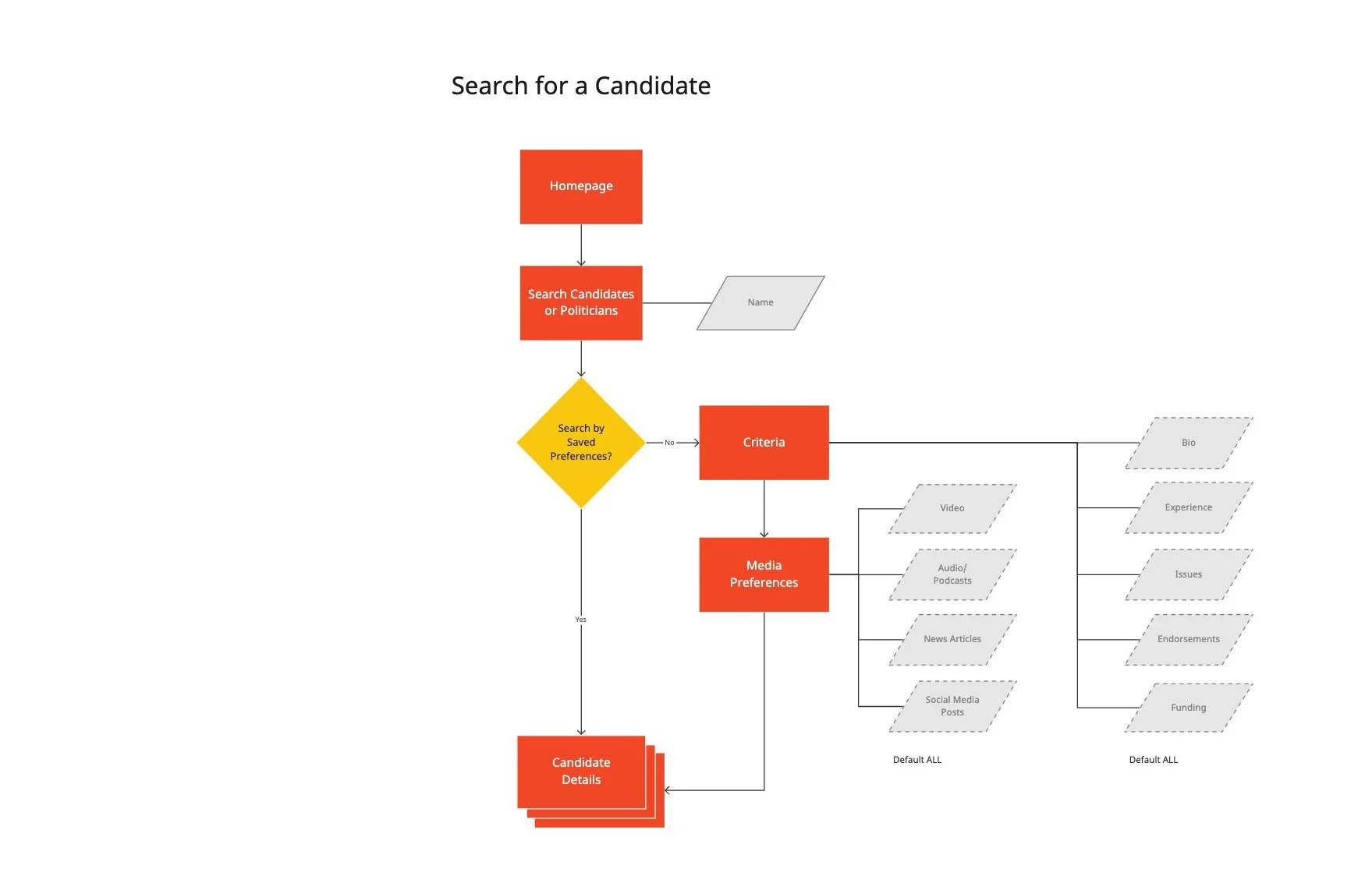
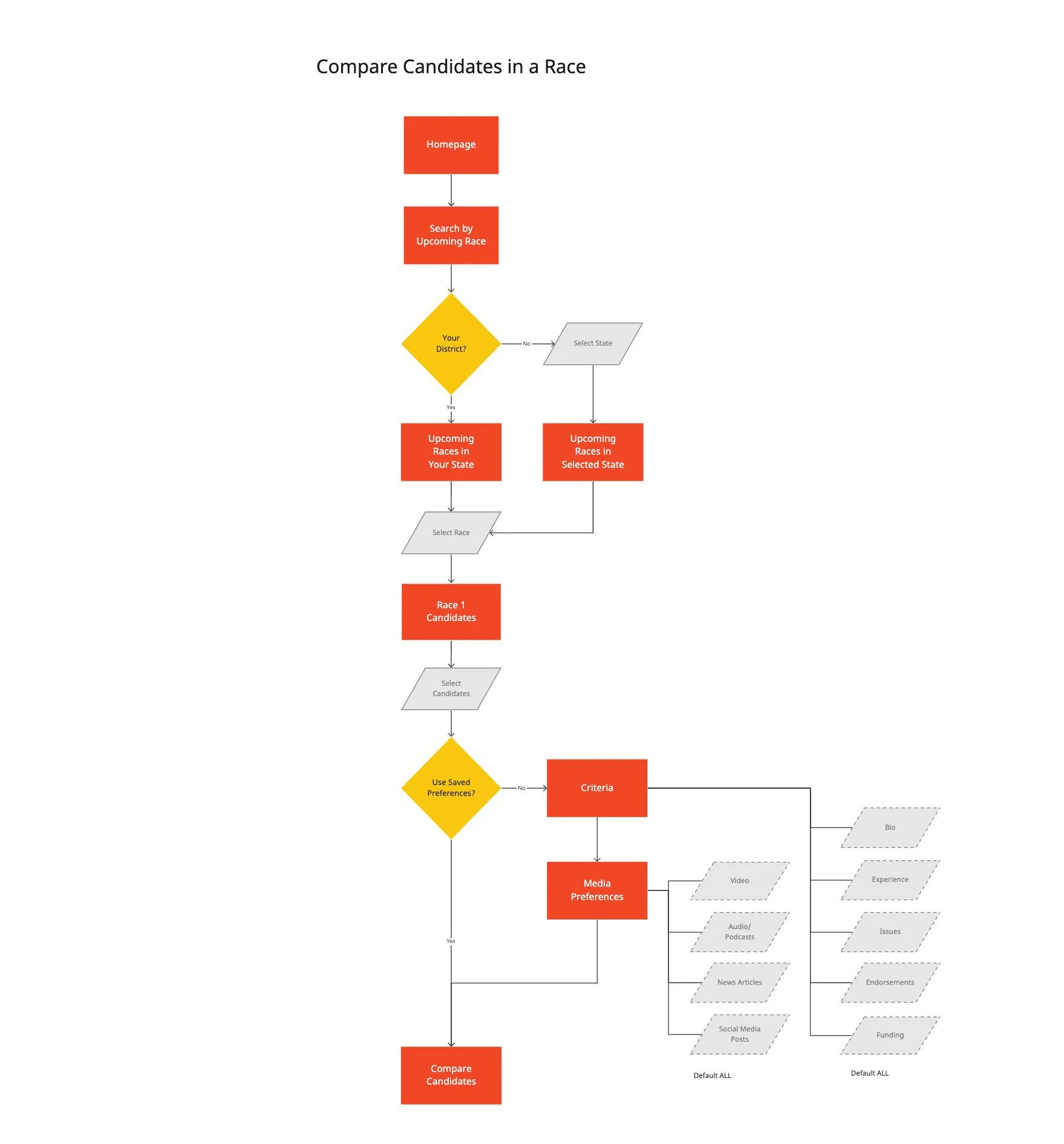
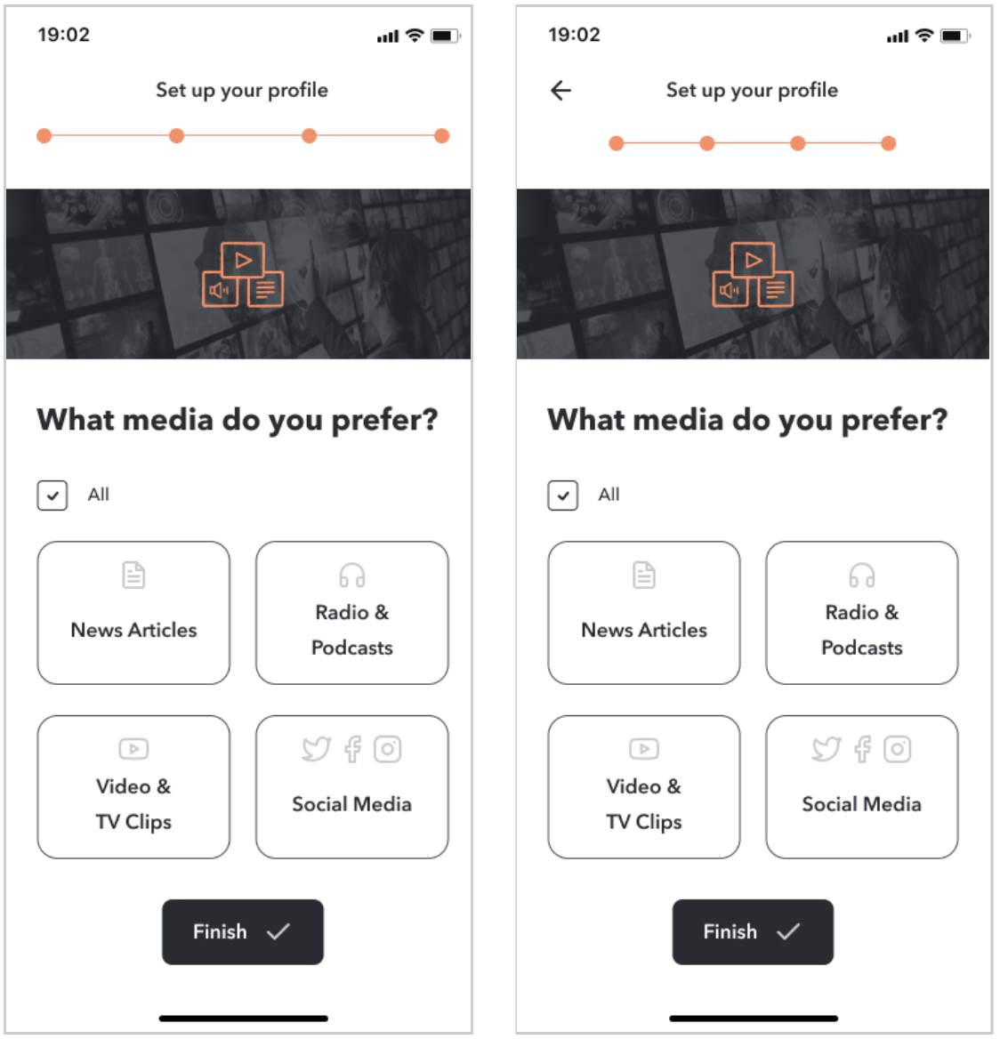
The core features of the app would allow the user to either search for a single candidate or politician, to search for an upcoming primary race in order to compare candidates running, and a comprehensive onboarding that would collect the user’s address in order to tailor ballot information based on their district, and set up their research preferences (candidate criteria and preferred media) but still allow for modifications post-onboarding.
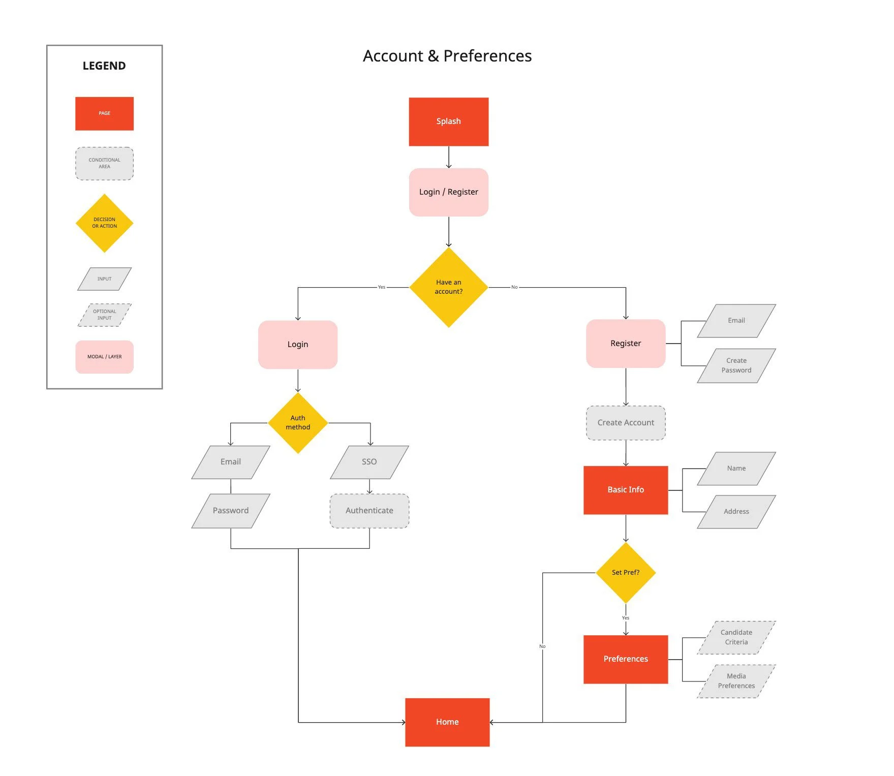
Guerilla Usability Testing
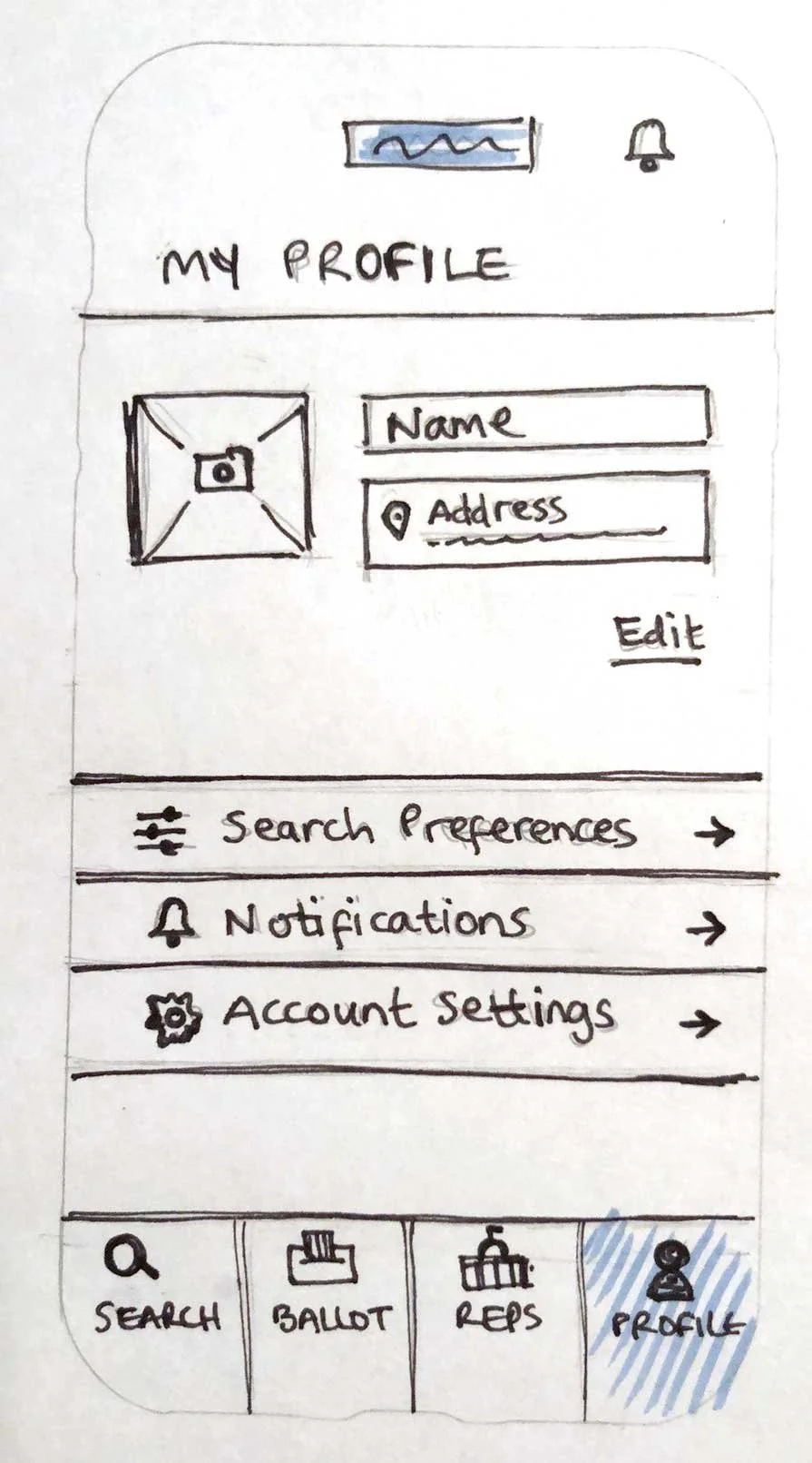
I recruited 4 participants for testing; 2 were done over video calls and 2 in-person. I created a rough prototype using pen and paper sketches. For tests that were conducted remotely, I shared a link to the prototype on the call.
My main goals for this test were to:
find out if the selected navigation is intuitive enough for users to figure out how to perform the main tasks identified as the project Red Routes—
Search for a candidate/politician
Compare candidates in a race
evaluate whether or not the purpose of Search Preferences during onboarding was clear to the user, and if they are able to modify them easily.


Findings
It was clear I had to rework the onboarding and make the Criteria and Media selection steps mandatory. In my initial sketches, these steps could be skipped and half the participants did that and later could not figure out how to modify their search preferences. It was also clear that it would be much easier if users were able to modify these filters directly in each candidate results screen rather than having to go to their account preferences.
I also had to rethink the main navigation because the “Search” tab was confusing for some of the test participants as was the “Upcoming Races” button in the Search screen. I opted to change “Search” to “Home” instead with two options:
Search for Candidate
Compare Candidates
Design
One of my observations from the competitive analysis was how visually cluttered most of the websites and apps were. One of the reasons, besides content density, was the use of colour. Because of this, I wanted to stick with a minimal colour palette. I drew inspiration from newspapers, kindle paperwhite and tablets. I felt a pared down UI would be more conducive to long-form reading and the user would be able to read through content without being visually overwhelmed.

Style Guide
I chose a mostly black and white palette with pops of colour to highlight political party affiliation. I wanted to ensure readability so I selected a sans serif typeface which is easier to read on screens and Avenir provided lots of weights for contrast without resorting to colour.


Design Prototype
Usability Testing
Round 1
I conducted 4 moderated tests remotely via zoom with participants I recruited through my social network. Each of the participants is a registered voter and regularly read or do research on their phones. I shared a Figma prototype during the call so participants did not see it prior to the test. Participants shared their screen and I asked each of them to talk me through their thoughts and actions as they went through a series of tasks. Even though this is a mobile app, they clicked through the prototype on a computer, keeping in mind that it might feel a little bit different using a mouse or trackpad but they can mimic the same motions they would do on a phone. The goals of the test were to:
Gauge the ease of the app’s sign up and onboarding process that allows the user to customise their search preferences.
Evaluate the effectiveness of “search for a candidate/politician” feature and whether users find it easy to navigate the results, modify preferences, and bookmark the candidate’s profile
Evaluate the effectiveness of “compare candidates” feature
I was most concerned about the onboarding process and whether or not users would find it too long or complicated. I felt confident that the search feature to look up an individual candidate or politician would be easy enough but I was less certain about the “Compare Candidates” feature which would require users to locate the race at the Federal, State or Local level.
Most of the problems identified in the first round required minor UI tweaks to make elements like tabs more prominent, or use more recognizable icons. The source of bio content was a concern for most of the participants. The prototype showed candidate bios pulled from their campaign websites but users wanted more impartial sources.

Most users wanted the ability to go back/forward during the onboarding steps in order to modify some of their selections, and this was an easy fix.
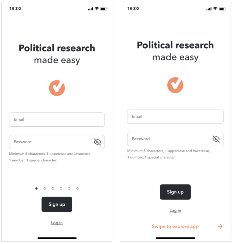
Users also missed the Intro screens during sign up. The swipe dots were very subtle and only one user discovered them. After skimming through, the user commented that they typically ignore these types of screens.

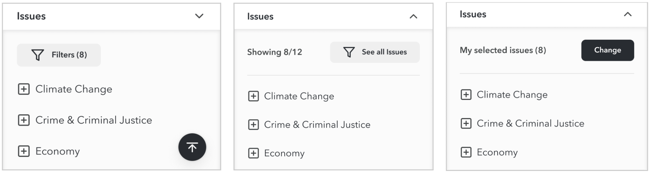
The Issues filter on a candidate’s results page was a source of confusion. Most users did not realise the issues shown were the ones they had selected during onboarding. The Filter button also did not stand out enough and when users did eventually discover they can modify the list, the confirmation modal to update their global search preferences was confusing.

Accessibility
I conducted an accessibility audit of the design elements—text and icon colours, font size, and updated colours to meet the minimum contrast requirement. I darkened some of the smaller text styles, which reduced the contrast between selected and unselected elements so I used the brand Orange colour for highlight in the mobile nav. The political party affiliation tags also did not pass minimum standards so I chose slightly darker shades to improve readability.
Round 2
I validated the need for the Back button in onboarding— several participants used it during the test. The bolder Tab design was also more noticeable to users and the new Update Preferences (issues filter) modal was much easier to understand.

Half of the participants noticed the “Explore this app” option during sign up so the new design was more successful than the previous one with the swipe dots. But the feedback was still the same, with users saying they rarely pay much attention to these types of introductory screens.
needs more work
The Issues selector that popped up during Onboarding was jarring to users so I felt it was best to remove it and allow filtering only in the Results pages instead. Users could choose Issues as a criteria they want to see about Candidates but it would default to showing all Issues. I worked on more iterations of the Filter experience based on feedback from Round 1 (left) and Round 2 (middle) of testing and plan to test the latest version (right).
Learnings
Overall, the app was successful in delivering an adequate amount of information on candidates that most voters need in order to make informed decisions about them. The usability tests proved that this is a resource that many voters would love to have. Most of the participants really appreciated the ability to curate the information they want to see, the news sources they trust, and the type of media they prefer to consume.
The compare candidates feature was intuitive for users from the guerilla usability testing phase through to both rounds testing with high-fidelity prototypes but there is still a lot of room for improvement. Some users commented on the identical information displayed in a single candidate search and the compare candidates screen. The only benefit of the compare screen is the ability to swipe back and forth on each candidate but it does little to highlight nuances between these candidates, which was a key pain point.
Some suggestions that came out of the second round of testing were particularly interesting. What if the primary candidates were compared in a similar way to how car dealership websites compare car models? This could work well to highlight subtle differences in each candidate's stance on local issues for instance, and would be worthwhile to explore more design solutions.